Research paper abstract 20th century architectural tipography
Publicaciones, Trabajos de Investigación y Tesis Doctorales/Publications, research papers and PhD Theses
|
Abstract
del Trabajo de Investigación. La Tipografía Arquitectónica del siglo XX
Research paper abstract 20th century architectural tipography
|
|
| Mención
COACV 2003-2004/2003-2004 COACV Mention Publicaciones, Trabajos de Investigación y Tesis Doctorales/Publications, research papers and PhD Theses |
Jose Luis Ros Andreu |
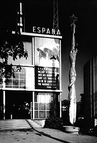 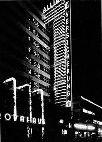 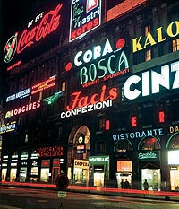 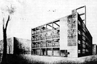 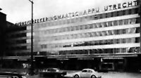 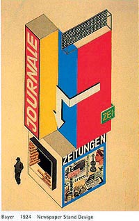 |
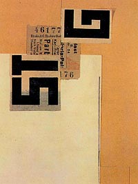
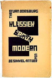
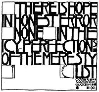
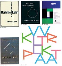
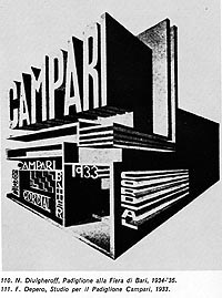
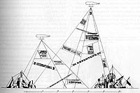
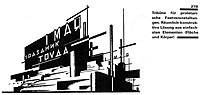
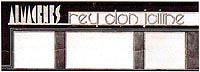
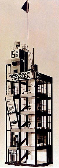
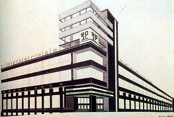
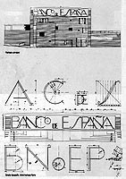
La bibliografía sobre diseño grafico y tipográfico es cada vez mas abundante, tanto desde el punto de vista general, reedición de viejos tratados y manuales, como desde el punto de vista mas especializado, nuevos manuales, monografías sobre tipógrafos y o diseñadores gráficos sobre la tipografía en países o en momentos históricos concretos, revistas dedicadas al tema, paginas Web, etc. Sin embargo, resulta difícil encontrar bibliografía dedicada al tema de la tipografía y la arquitectura, con la excepción del libro de Jock Kinneir1 que es un estudio generalista, no hemos encontrado ningún texto dedicado al tema en concreto. Así pues, resultaba tentador iniciar la tarea concreta de investigación, por un lado hemos hecho un largo recorrido a lo largo de la arquitectura y los arquitectos del siglo XX, intentando localizar arquitecturas tipográficas de los protagonistas del M.M. desde los pioneros hasta nuestros días, Wrigth, Mies, Le Corbusier, Aalto, Asplund, Rietveld, Duiker, Van der Vlugt, Stam, Gropius, Taut, Meyer, Moneo, Nouvel, Herzog y De Meuron, y un largo etc, en paralelo y siguiendo la historia de la tipografía del siglo XX, de la mano de Richard Hollis2 Lewis Blackwell3 y Friederich Friedl4 íbamos intentando correlacionar ambas líneas, aparecieron El Lissitttzky, Rodchenko, Moholy Nagy, Leistikov, Jan Tschichold, Piet Swart, y los tipógrafos del Ring, Herbert Bayer, Karel Teige, Eric Gill, Max Bill, Vivarelli, Herbert Matter, Otl Aicher y Bruce Mau, etc. Y tantos otros que por otro lado nos han situado frente a la producción tipográfico arquitectónica de libros y revistas, que gracias al numero especial de Rassegna “Architecttura nelle riviste d’avanguardia”, nos ha mostrado la dirección en la que encontrar materiales, igual que los excelentes catálogos del IVAM y Reina Sofía dedicados al tema. La investigación ha ido poco a poco ampliándose pasando de la TIPOGRAFIA EN LAS OBRAS Y PROYECTOS DE ARQUITECTURA, A LOS LIBROS Y REVISTAS DE ARQUITECTURA, que poco a poco generaba anexos (subcarpetas) por géneros o temas, Así: TIENDAS Y TIPOGRAFIA (tiendas francesas, tiendas alemanas, tiendas catalanas, grandes almacenes). TUMBAS, MONUMENTOS Y TIPOGRAFIA. NEON Y TIPOGRAFIA. TIPOGRAFIA TIPOGRAFIA. ARTE, ARTISTAS Y TIPOGRAFIA. CIUDAD Y TIPOGRAFIA. EXPOSICIONES Y TIPOGRAFIA. MUSEOS Y TIPOGRAFIA. LIBROS DE ARQUITECTURA Y TIPOGRAFIA. (Con subcarpetas del WENDINGEN, NEUE FRANKFURT, ABC, ARCHIGRAM, etc) Y UN GRAN ANEXO GENERAL DE VARIOS. Donde hemos ido acumulando materiales vinculados al tema que esperan clasificación (vallas publicitarias de gran dimensión, publicidad textil cubriendo fachadas, etc.) Estos anexos, así como los materiales encontrados sobre arquitectos como De Koenick, Lurçat, Schindler, V. Vigano, La Wagner Schule, Welles Coates, Foster o Ghery. no se han integrado en el texto resumen del trabajo de investigación. Respecto de la arquitectura de posguerra hasta nuestros días quedan vacíos o semivacíos algunos países europeos, América Latina incluido Méjico, donde tenemos buenos referentes, así como en Argentina y Brasil, al igual que en todo el mundo oriental, especialmente Japón. Nuestro interés no es especialmente historiográfico, sabemos que la investigación también podría haber ido bajando en el tiempo, Eclecticismo, Neoclasicismo, Barroco, etc. mas bien hemos trabajado ahora en la línea opuesta, intentando descubrir desde los pioneros, las raíces, tanto infraestructurales como ideológicas de la relación tipografía arquitectura, ver el estado actual de la cuestión y poner al servicio de la arquitectura y los arquitectos los resultados aportando mas y mejores materiales para desarrollar la cultura del proyecto. Es obvio que resulta difícil, por no decir imposible, mostrar sistemáticamente todos los materiales encontrados, así pues, la exposición consistirá en mostrar aquellos materiales encontrados hasta los inicios de la segunda guerra mundial y una imagen resumen de las actitudes arquitectónicas mas significativas en el momento actual. |
The
literature on graphic and typographic design is increasingly abundant,
both from a general point of view, with new editions of classic texts and
manuals, and from a more specialised angle: new manuals, monographs on
typographers and/or graphic designers, on typography in particular
countries or at particular moments in history, magazines on the subject,
Web pages, etc. However, it is difficult to find any
literature on the subject of typography and architecture other than Jock
Kinneir's book1, which is a general study. We have
not found any work written specifically on this subject. Consequently,
embarking on the concrete task of researching it was a tempting prospect.
On the one hand, we have been on a long tour of the architecture and
architects of the 20th century, trying to locate typological architectures
by the masters of the Modern Movement, from the pioneers to our own days:
Wright, Mies, Le Corbusier, Aalto, Asplund, Rietveld, Duiker, Van der
Vlugt, Stam, Gropius, Taut, Meyer, Moneo, Nouvel, Herzog, De Meuron and
many others. On the other, a parallel tour followed the history of 20th
century typography, with the assistance of Richard Hollis2,
Lewis Blackwell3 and Friederich Friedl4. We tried to correlate the two and discovered El
Lissitttzky, Rodchenko, Moholy Nagy, Leistikov, Jan Tschichold, Piet
Swart, the typographers of the 'ring neuer Werbegestalter', Herbert Bayer,
Karel Teige, Max Bill, etc., Eric Gill, Vivarelli, Herbert Matter, Otl
Aicher, Bruce Mau, and so many others. They led us to the architectural
typographic output of books and magazines and, thanks to the Rassegna
special on "Architettura nelle riviste d'avanguardia", pointed
in the direction where materials were to be found, as did the IVAM and
Reina Sofía museum's excellent catalogues in this field. The research subject gradually widened from
TYPOGRAPHY IN ARCHITECTURAL WORKS AND DESIGNS to include ARCHITECTURE
BOOKS AND MAGAZINES and little by little generated appendices
(sub-folders), classified by genre or theme, such as: SHOPS AND TYPOGRAPHY (French shops, German
shops, Catalan shops, department stores) TOMBS, MONUMENTS AND TYPOGRAPHY NEON AND TYPOGRAPHY REAL TYPOGRAPHY ART, ARTISTS AND TYPOGRAPHY CITY AND TYPOGRAPHY EXHIBITIONS AND TYPOGRAPHY MUSEUMS AND TYPOGRAPHY ARCHITECTURE BOOKS AND TYPOGRAPHY. (with
sub-folders on WENDINGEN, NEUE FRANKFURT, ABC, ARCHIGRAM, etc). AND A LARGE GENERAL APPENDIX LABELLED
MISCELLANEOUS where materials related to the subject have
accumulated pending classification (large advertising hoardings,
advertising tarpaulins on façades, etc). These appendices, as well as the materials
we unearthed on architects such as De Koenick, Lurçat, Schindler, V.
Vigano, the Wagner Schule, Welles Coates, Foster or Gehry, have not been
included in the research paper summary. For architecture from the post-war years to
today, there is a vacuum or semi-vacuum for some European countries, Latin
America, including Mexico, for which we have good references, as well as
for Argentina and Brazil, and the whole of the Far East, especially Japan. Our interest is not particularly
historical: we know that we could have pursued our investigations further
back in time, to Eclecticism, Neo-Classicism, Baroque, etc., but decided
to work more in the opposite direction, attempting to discover, from the
pioneers, the roots of the relationship between typography and
architecture in terms of both ideology and infrastructure, view the
current state of the matter and place the results at the disposal of
architecture and architects by providing more and better materials for
developing the culture of project design work. Evidently, it is difficult, if not impossible, to display all the materials encountered in a systematic manner. The exposition will therefore consist in showing the materials we have discovered that date from before and up to the end of the Second World War and giving a summary picture of the most significant architectural attitudes of today. |
    |
|
|
|
||
     |
    |
||
|
1.- Joc Kinneir. El diseño gráfico en la arquitectura. G.G. Barcelona 1982/Joc Kinneir. El diseño gráfico en la arquitectura. G.G. Barcelona 1982 2.- Richard Hollis. El Diseño gráfico. Destino. Barcelona 2000/ Richard Hollis. El Diseño gráfico. Destino. Barcelona 2000 3.- Lewis Blackwell. Tipografía del siglo XX. G.G. Barcelona 1998/Lewis Blackwell. Tipografía del siglo XX. G.G. Barcelona 1998 4.- Friedrich Friedl. Nicolaus Ott.Bernard Stein. Könemann Köln 1998/Friedrich Friedl.Nicolaus Ott.Bernard Stein. TYPOGRAPHY. Könemann Köln 1998 |